Maps
April 2024 - Github
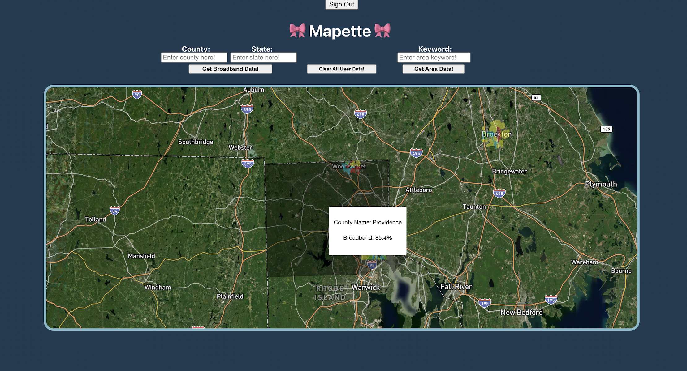
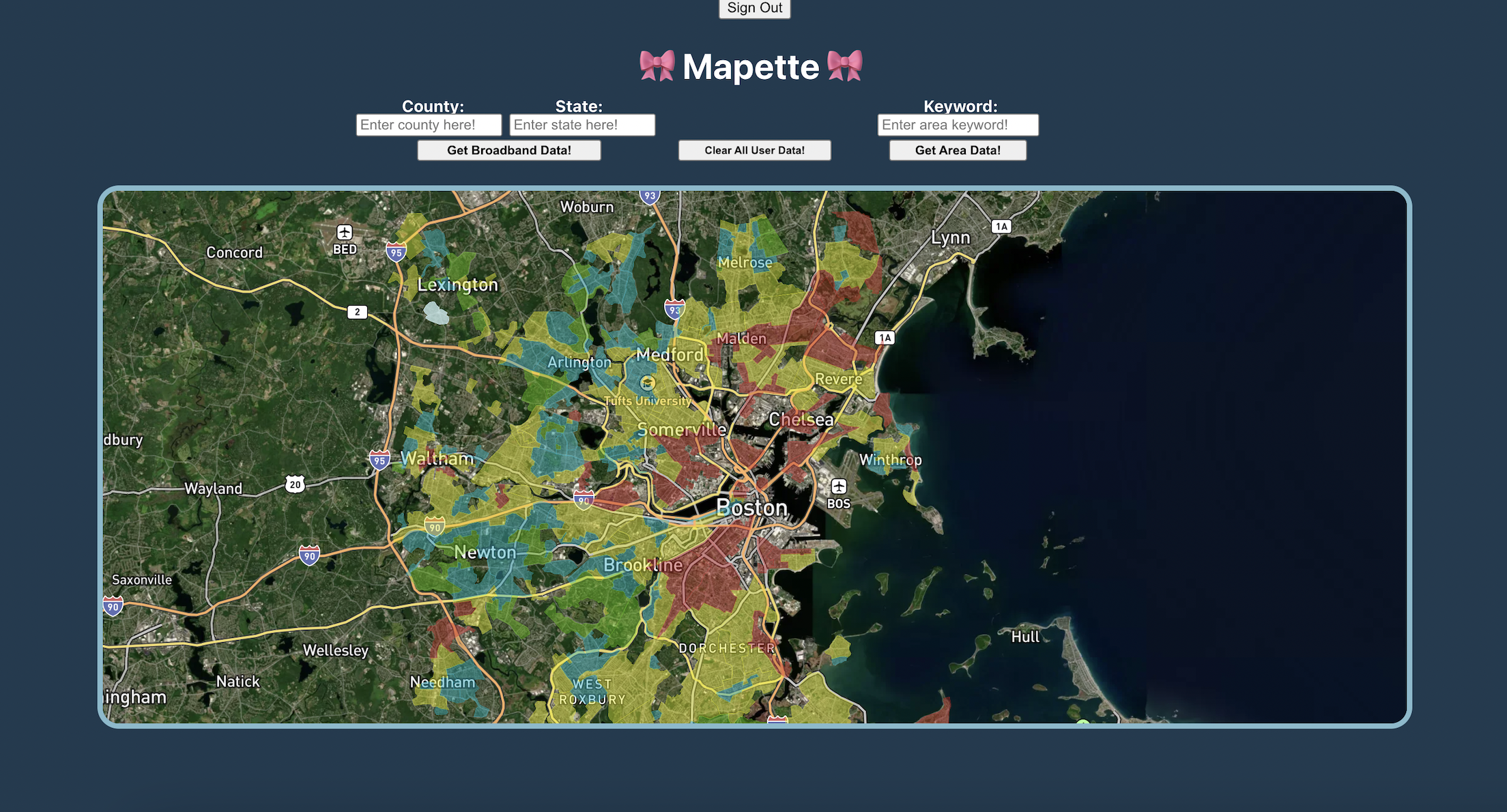
This application helps users and researchers visualize how historical redlining patterns intersect with current broadband access, enabling data-driven insights into digital equity. The interactive map is displayed through the implementation of Mapbox’s libraries. The map reflects redlining data, broadband data, and feature data through respective GeoJSONs. The colored overlays that are rendered immediately show the various intensities of redlining within the United States. A user can input a county and state and the map will fly to the respective county, highlight it in gray, and display its broadband data on hover. Additionally, a user can click on any point of the map to create a pin, which will persist on reload and login/logout. Backend developers can also use our API server to get filtered data through specified coordinates. Finally, a user can input any “descriptor” to highlight areas that contain that descriptor in white.